Wireframes in app development give founders, product owners, CTOs, and stakeholders a low-risk way to decide what the app must do before the team commits budget to UI design and engineering. A wireframe turns a product idea into screens, flows, states, roles, and feature boundaries that can be reviewed, estimated, and changed while change is still cheap.
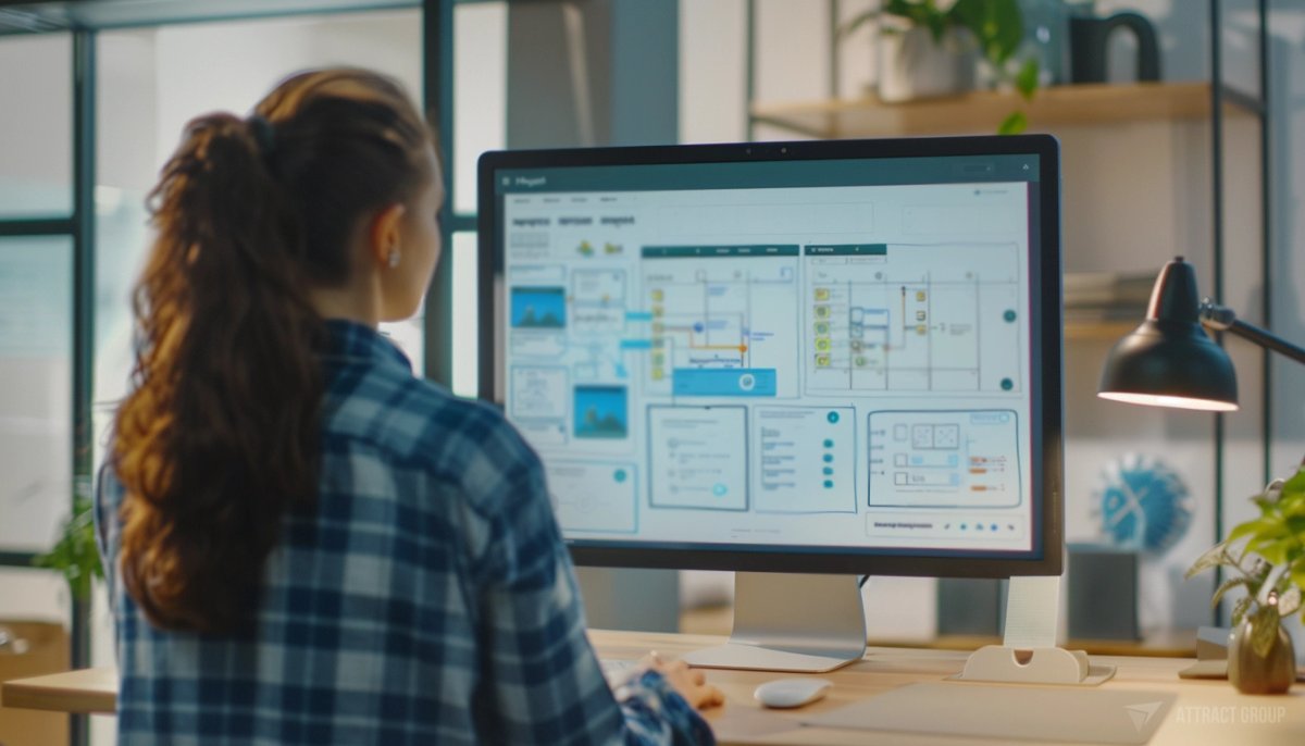
A wireframe can be a rough sketch, a clickable prototype, or a detailed grayscale layout. The useful part is not the visual polish. The useful part is the decision-making: what users see first, what actions they can take, what happens when data is missing, where payments or approvals enter the flow, and what developers need to build.
For a startup, wireframes protect the first budget. For an established company, they reduce the risk of rework across product, design, engineering, and operations. For a CTO, they expose hidden dependencies before sprint planning begins.
Why wireframes in app development matter before build
Wireframes in app development matter because they convert abstract product goals into screens and user flows that stakeholders can evaluate before build starts. They help teams agree on scope, spot missing states, compare feature options, and give designers and developers a clearer basis for estimates, timelines, and technical planning.
A written feature list can sound simple while hiding a large amount of product work. "Users can book a service" may involve onboarding, search, filters, availability rules, calendar views, payment, confirmation, cancellation, messaging, notifications, admin review, and support. A wireframe exposes that chain.
That exposure is useful because app estimates depend on interaction depth, data rules, user roles, integrations, and edge cases. The wireframe does not replace technical discovery, but it gives discovery something concrete to test.
A strong wireframe answers practical questions:
- Who is using this screen?
- What decision does the screen help them make?
- What action can they take next?
- What data must be shown?
- What happens if the user has no data yet?
- What happens after submission, approval, payment, or error?
- Which screens are part of the MVP and which can wait?
- Which parts need admin control?
For business stakeholders, this is where assumptions become visible. A founder may picture a two-screen flow. A product owner may see a workflow with approval stages. A developer may identify a required API or admin rule. The wireframe gives each person the same artifact to review.
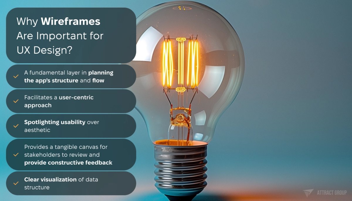
Wireframes also improve stakeholder feedback. People respond better to screens than to long requirements documents. They can point to a step and say, "This is missing," "This should come later," or "This will confuse our customer support team." That feedback is easier to process before visual design is complete.
The best time to create a wireframe for app development is after the product goal and target users are clear, but before UI design, backlog estimation, and engineering commitments. At that point, wireframes can still change the product plan instead of documenting decisions that are already expensive to reverse.
What to wireframe before you ask for an estimate
Before asking for a development estimate, wireframe the flows that carry the most business risk: onboarding, core transactions, user roles, payments, search, messaging, approvals, admin operations, and error states. You do not need every settings screen first. You need enough flow coverage to expose scope and technical dependencies.
Start with the main user journey. For a marketplace, this may be search, booking, payment, and communication. For a SaaS tool, it may be account setup, dashboard review, task creation, approval, and reporting. For a consumer app, it may be onboarding, feed behavior, content creation, sharing, and notifications.
A practical scope map often includes:
- Public entry points: landing screen, sign-up, sign-in, password recovery
- First-time experience: onboarding, permissions, profile setup
- Core user flow: search, select, configure, book, buy, post, upload, approve
- Account flow: profile, settings, subscription, saved items
- Operational flow: admin, moderation, support, reporting
- System states: empty, loading, error, success, locked, offline
- Integration points: payment gateway, maps, calendar, chat, CRM, analytics
- Notifications: email, push, in-app alerts, reminders
This is where business analysis and wireframing work well together. Business analysis defines rules, roles, constraints, and release priorities. Wireframes show how those rules behave on screen.
For MVP planning, wireframes help separate necessary release features from attractive ideas that can wait. If the product is in early validation, connect wireframes to MVP development decisions. The goal is to release the smallest version that can prove the product path without breaking core usability.
A multi-sided product makes this especially important. In the Curbside Kitchen project, Attract Group delivered a custom marketplace connecting food truck owners with property managers and companies, supporting booking, communication, and recurring operations. A product like this cannot be scoped from one user journey. It needs mapped flows for truck owners, property managers, companies, booking logic, messages, and repeat operational tasks.
That type of flow mapping prevents a common estimating problem: the buyer asks for "a marketplace," while the build actually includes several products in one. Wireframes make those user paths visible before delivery planning.

For an estimate, do not stop at the happy path. Add screens for what happens when:
- A user has not completed a profile
- No results match a search
- A booking request is rejected
- A payment fails
- A required permission is not granted
- An admin needs to reverse, edit, or suspend an action
- A recurring operation needs to be copied, paused, or changed
These screens may look minor, but they affect design, backend logic, QA, and support. If they are absent during planning, they often reappear during development as scope pressure.
Which fidelity level to use
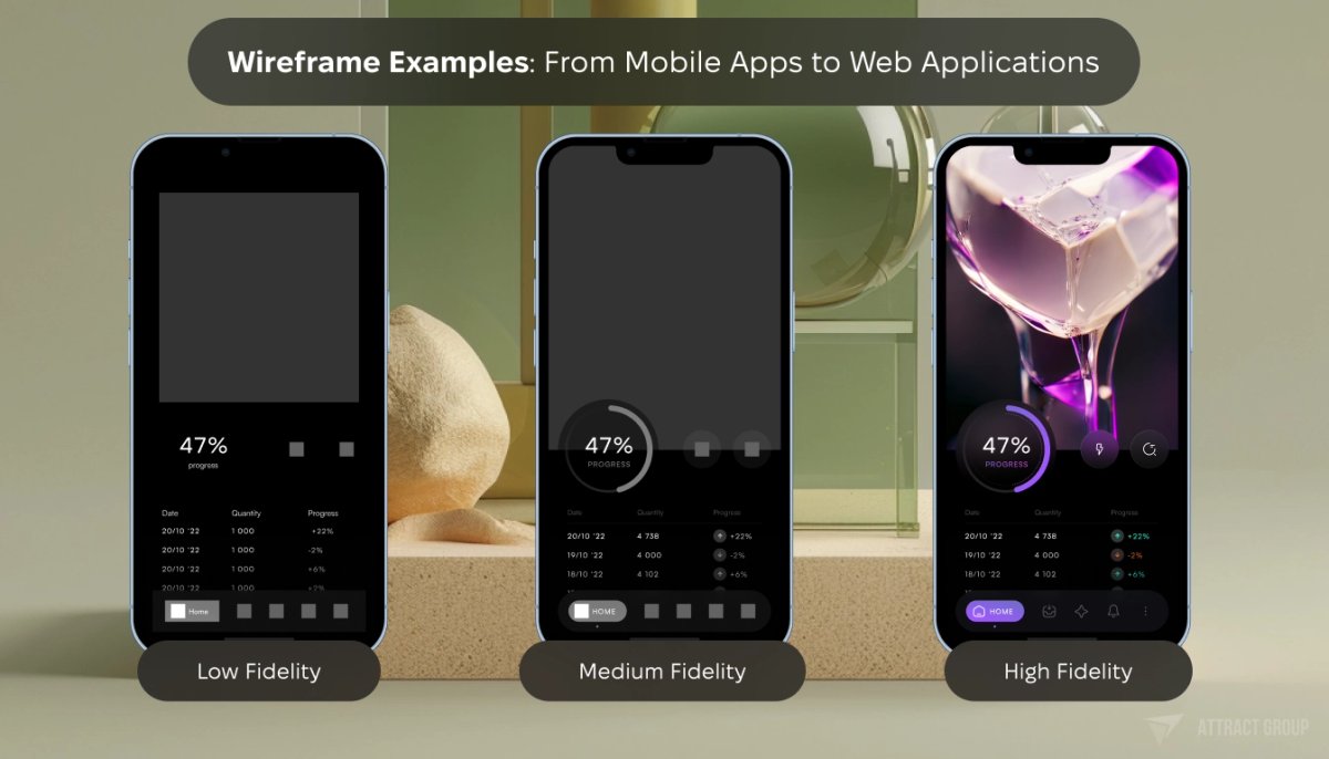
Use low-fidelity wireframes to test structure and flow, mid-fidelity wireframes to prepare scope and stakeholder review, and high-fidelity wireframes or prototypes when interaction details affect decisions. The right fidelity depends on the risk you are trying to reduce, not on how polished the product should look.
Low fidelity vs high fidelity wireframes is a common planning question. The short answer: do not use a high-fidelity artifact to avoid product decisions. A clean visual layer can hide unresolved logic. Start rough when the team still needs to debate flow, then add detail when the structure is stable.
| Fidelity level | What it looks like | Best use | Buyer risk reduced | When to move on |
|---|---|---|---|---|
| Low fidelity | Sketches, boxes, simple labels, rough layouts | Early product discovery, user flow discussion, fast scope debate | Building the wrong flow or missing a user role | Stakeholders agree on major screens and paths |
| Mid fidelity | Clear grayscale screens, real content labels, basic hierarchy | Estimation, stakeholder review, BA documentation, MVP planning | Underestimated screens, missing states, unclear requirements | Main states, actions, and screen logic are documented |
| High fidelity | Detailed layout, near-final spacing, interaction notes, clickable prototype | Usability testing, investor demo, complex interaction review, UI handoff | Misread interactions, visual hierarchy issues, handoff gaps | UI design system and engineering requirements are ready |

Low-fidelity wireframes are useful when the team is still deciding what the product is. They keep the conversation focused on structure. A founder can change a checkout step or remove a feature without feeling that finished design work is being discarded.
Mid-fidelity wireframes are often the best format for budget planning. They are detailed enough for estimation, but still flexible enough for revision. They show screen hierarchy, actions, labels, form fields, and user states without requiring final colors, typography, or brand treatment.
High-fidelity wireframes or prototypes are useful when the interaction itself carries risk. Examples include swipe-based behavior, live content, timed voting, multi-step configuration, map interaction, data-heavy dashboards, and custom mobile gestures. In these cases, engineering needs to understand behavior, not only layout.
Wireframes should feed into UI/UX design, not replace it. Wireframes decide structure. UI design decides visual treatment, component behavior, accessibility, responsive layout, and the final experience users will see.
A simple rule works well: increase fidelity only when the next decision requires more detail. If stakeholders are still debating the order of onboarding steps, stay low or mid fidelity. If developers need to know how a live voting timer behaves across states, raise the fidelity and add interaction notes.
How to create app wireframes
To create app wireframes, define user roles, map the main journeys, list required screens, sketch the simplest version of each screen, add states and edge cases, then review the flow with stakeholders before UI design. Treat wireframing as a product planning exercise, not a drawing task.
A workable process looks like this:
- Define the product outcome. State what the app must help users do. Avoid starting with a long feature wish list.
- Identify user roles. Separate customers, admins, vendors, creators, managers, and support users. Each role may need a separate flow.
- Map the primary journey. Write the steps from entry to completed action.
- Turn steps into screens. Each decision, input, review, or confirmation may need its own screen.
- Add screen purpose. Every screen should have one main job.
- Add states. Include empty, loading, error, success, permission denied, and saved states where relevant.
- Mark integrations. Note where maps, payments, chat, video, analytics, AI, CRM, or calendar tools enter the flow.
- Review with stakeholders. Ask where the flow fails, where the business rule is missing, and where support teams may struggle.
- Prepare for design and development. Add annotations, acceptance notes, and open questions.
A wireframe can be created in Figma, FigJam, Miro, Balsamiq, Sketch, Adobe XD, or even on paper. The tool matters less than the quality of decisions captured. A tidy file with unresolved product rules will still create rework.
If you are preparing for mobile app development, remember that mobile wireframes need platform context. Navigation patterns, permission prompts, push notifications, keyboard behavior, camera access, location use, and offline states can affect the flow. A web dashboard may need different treatment for tables, filters, exports, and role-based access.
For mobile and web apps, annotation is where many wireframes become more useful. Add short notes near the screen or in a linked document:
- Trigger: what brings the user to this screen
- User action: what the user can do here
- Data required: what must be loaded or saved
- Validation: what makes a form invalid
- Error handling: what happens when the system fails
- Permissions: who can see or edit the screen
- Analytics: what should be tracked
- Open questions: what still needs a business decision
When reviewing wireframes, avoid asking only whether people "like" the screen. Ask task-based questions:
- Can the user complete the main action without extra explanation?
- Is any step doing two jobs at once?
- Does the flow support first-time and returning users?
- Are there screens for failures and empty data?
- Do admin users have enough control to run the operation?
- Does this belong in the MVP, or can it move to a later release?
These questions keep the discussion tied to scope and user behavior.
How wireframes reduce budget risk and improve handoff readiness
Need app wireframes before build?
We can turn product ideas, roles, and user journeys into wireframes your design and development team can estimate.
Wireframes reduce budget risk by making scope visible before teams estimate design and engineering work. They improve handoff readiness when each screen has a purpose, state coverage, role rules, integration notes, and open questions resolved or tracked. A good handoff helps product, design, development, QA, and project management work from the same plan.
Budget risk usually comes from unclear scope rather than a single missed screen. The team may know that an app needs booking, but not whether booking includes rescheduling, cancellation rules, deposits, recurring reservations, admin overrides, conflict detection, and notification templates. Wireframes make those branches reviewable.
This matters for delivery planning. Project management depends on clear backlog items, dependencies, review points, and acceptance criteria. Wireframes help convert a product concept into work that can be planned across design, backend, frontend, QA, and release management.
Use this checklist before moving from wireframes to UI design or development:
| Handoff item | What to check | Why it matters |
|---|---|---|
| User roles | Each role has its own entry points, permissions, and main actions | Prevents missed admin, vendor, manager, or support flows |
| Core journeys | Main flows are mapped from start to completion | Gives estimators a full view of the product path |
| Screen inventory | All planned screens are listed and grouped by feature | Helps create a backlog and avoid hidden scope |
| States | Empty, loading, error, success, locked, and permission states are included | Reduces rework during QA and frontend development |
| Business rules | Rules are noted near the affected screen or linked in requirements | Helps developers understand why a screen behaves a certain way |
| Integrations | Payments, maps, chat, video, CRM, analytics, and other systems are marked | Supports technical planning and dependency review |
| Content needs | Labels, sample data, input types, and required fields are present | Prevents vague layouts that break during UI design |
| Responsive behavior | Mobile, tablet, and desktop needs are clear where relevant | Avoids late layout changes |
| Open questions | Unresolved decisions are listed with owners | Keeps unknowns visible instead of burying them in the backlog |
| Acceptance notes | Each flow has a clear expected result | Helps QA and product owners review completed work |

Curbside Kitchen is a good example of why readiness matters in multi-sided systems. Food truck owners, property managers, and companies do not share the same workflow. Booking, communication, and recurring operations all create states that must be understood before development. A wireframe set for this type of product should separate each role and then map where the roles meet.
High-interaction consumer products have a different type of risk. In the Flustr case, the product involved a social video platform with live battles, donations, voting windows, music library hooks, a Flutter mobile client, and a Python/Django backend. For this type of app, wireframes need to describe timing, user feedback, content states, and what happens during live interaction. Static screens alone are not enough; behavior notes and clickable prototypes can reduce ambiguity.
If you need help turning a product idea into screen flows, scope, and a build-ready plan, Attract Group can support UX discovery and app scope planning through business analysis, UX planning, and delivery preparation.
Get expert wireframing for your app
Our seasoned designers craft strategic wireframes that optimize UX and streamline development. Let us plan the blueprint for your successful app.
App wireframe examples: marketplace, SaaS, and consumer app flows
Useful app wireframe examples show decisions, not decoration. For each product type, the wireframe should reveal user roles, screen order, required data, failure states, and operational controls. A marketplace, SaaS dashboard, and consumer content app each need a different wireframing focus because their risks are different.
For a marketplace app, focus on supply, demand, and transaction trust. The wireframe should separate buyer and seller journeys, then map where they meet.
Screens to include:
- Buyer onboarding
- Seller onboarding
- Search and filters
- Listing details
- Availability or inventory
- Booking or checkout
- Payment status
- Messaging
- Ratings or dispute flow
- Admin review and moderation
For a SaaS or internal business app, focus on work completion, permissions, and data clarity. The dashboard should not be designed first only because it feels central. Start with the user task that creates business output.
Screens to include:
- Role-based sign-in
- Workspace or account setup
- Dashboard with real sample data
- Task creation or record creation
- Approval flow
- Filters and saved views
- Notifications
- Export or reporting
- Admin permissions
- Audit or activity history
For a consumer content or social app, focus on speed, feedback, and repeated engagement loops. Wireframes should show what users do in the first session and what brings them back.
Screens to include:
- Permission prompts
- Profile setup
- Feed or discovery
- Content creation
- Upload progress
- Reactions, comments, voting, or sharing
- Live or timed interaction states
- Notifications
- Moderation and reporting
- Empty and blocked states

These examples also show why a single generic app wireframe template rarely works for serious planning. Templates can help teams start, but the product logic must be specific. A food truck marketplace, a compliance dashboard, and a live video contest app can all have onboarding and profiles, yet their risk sits in different flows.
Before you approve wireframes, ask five buyer-level questions:
- Can we explain the MVP from these screens without a separate presentation?
- Can development estimate the main flows from this file and its notes?
- Are the expensive parts of the product visible?
- Are admin and support operations included?
- Do stakeholders know which decisions are still open?
If the answer is yes, the wireframes are ready to move into UI design, technical estimation, and backlog planning. If the answer is no, keep the wireframes in discovery a little longer. That time is usually easier to manage than redesigning the product during active development.