
In the competitive realm of online retail, where every click could unveil a new customer or a missed opportunity, understanding and implementing the best practices of eCommerce web design is not just beneficial, it’s imperative. A well-structured website with thoughtful user experience (UX) is more than an online storefront; it’s the virtual embodiment of a brand and often the first touchpoint for customers.
Today, in an era where digital real estate is as valuable as its physical counterpart, a meticulously crafted e-commerce platform can substantially tilt the scales in favor of business success. From the arrangement of information to the agility of navigation, each element plays a crucial role in not only attracting customers but also in securing their loyalty. Adhering to e-commerce web design tips can be the differentiator between a flourishing online enterprise and one that falls by the digital wayside.
Key Takeaways
- Effective eCommerce web design marries functionality with aesthetics for an optimal shopping experience.
- Adopting best practices in web design is crucial due to the profound impact on sale conversions.
- UX considerations should prioritize the ease and pleasure of customer interaction with the website.
- Designing with a mobile-first approach is vital to cater to the increasing number of users shopping on smartphones.
- Sleek, fast, and secure websites gain not just consumer traffic but also consumer trust.
- Continuous improvement, guided by customer behavior and preferences, refines and elevates the eCommerce experience.
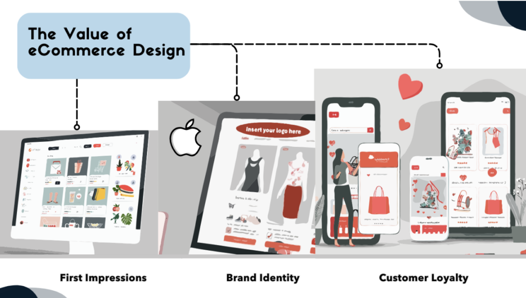
Understanding eCommerce Web Design
When diving into the world of online retail, the significance of stellar eCommerce web design becomes rapidly apparent. A digital storefront reflects not only the brand’s visual identity but also its commitment to providing a seamless, engaging shopping experience. Captivating web design serves as one of the most potent tools in a retailer’s arsenal, engineered to craft an indelible impression on potential customers. Mastering the art of best web ecommerce design can elevate a business, turning casual browsers into loyal customers.
The Importance of Good eCommerce Web Design
In the digital marketplace, the importance of exceptional web design cannot be overstated. From the very first moment a potential shopper encounters your site, judgments are made, and perceptions are formed. High-quality design imbued with the principles of top ecommerce web design fosters trust and credibility, while the bespoke crafting of the site reaffirms the distinct brand narrative that resonates more personally with the consumer.
Entrepreneurs yearning for success recognize that eCommerce is more than a transactional platform — it’s an expansive stage where their brand performs. Each design element, from typography and color palettes to the functionality of navigation menus, plays a strategic role in harmonizing the buyer’s journey. The finer details of eCommerce design are instrumental in converting first-time visitors into brand ambassadors.
The foundation of superb online retail hangs on the fluency of user experience, the ease of finding desired products, and the fulfillment of needs with minimal friction. To underscore this reality, consider the design elements that core industry players integrate to secure their market position. The pursuit of best web ecommerce design is about harnessing creativity and strategic thinking to foster a digital environment where customers feel both understood and valued.
As consumers navigate through the lanes of digital storefronts, those with intuitive design, clear messaging, and responsive layouts stand out. These stores master the art of first impressions and subsequent interactions, ensuring that the brand stays etched in the consumer’s memory, inciting both return visits and word-of-mouth recommendations. Aligning with top ecommerce web design principles is therefore not a luxury — it’s a critical component of a successful online retail strategy.
Indeed, the interplay of these design specifics speaks volumes about a retailer’s dedication to not just meeting but surpassing customer expectations. As online storefronts evolve, keeping a pace with emergent best web ecommerce design practices will continue to be the cornerstone of eCommerce excellence.
Want to improve your eCommerce site?
Our expert web designers can audit your site and provide recommendations to optimize conversions.
Key Principles of eCommerce Web Design Best Practices
When embarking on the journey to craft an online store, adhering to the fundamental principles of eCommerce web design is not merely a suggestion but a necessity. These principles nurture user engagement and drive conversions, carving the path for a prosperous eCommerce journey. Clear understanding and skillful application of best practices in eCommerce web design ensure that businesses can address consumer needs effectively while maintaining aesthetic appeal and functional efficiency. Let us delve into the essential elements that constitute a top-notch eCommerce website.
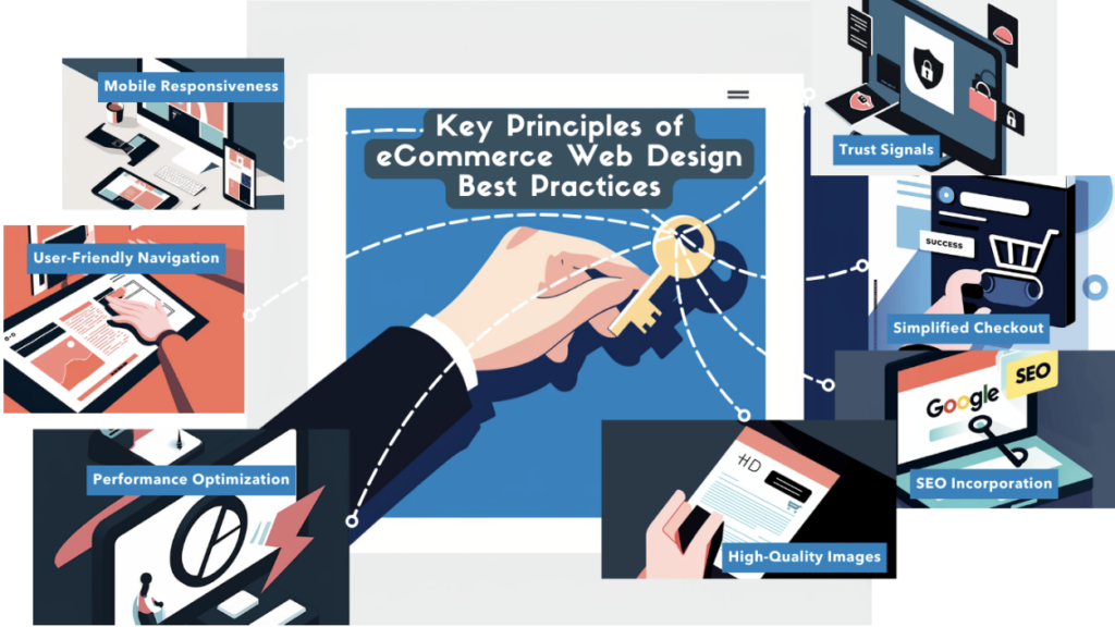
Mobile Responsiveness and Cross-Platform Compatibility
In today’s market, mobile responsiveness and cross-platform compatibility are not optional — they are essential. Ensuring seamless shopping experiences across various devices, this approach meets users where they are, regardless of their choice of technology. A mobile-friendly design is a cornerstone of best practices for eCommerce web design, enhancing accessibility and customer satisfaction.
User-Friendly Navigation and Layout
To convert visitors into customers, eCommerce sites must boast a user-friendly navigation and layout. This involves intuitive menus and clear pathways that guide shoppers effortlessly from homepage to checkout. By minimizing confusion and streamlining the buyer’s journey, online stores can provide an enjoyable shopping experience, crucial for fostering customer loyalty.
Fast Loading Times and Performance Optimization
Speed is a silent salesman in the world of online retail. Fast loading times and performance optimization ensure that potential buyers are not lost to the quicksand of slow page loads and cumbersome site performance, making this a critical aspect of ecommerce web design tips.
High-Quality Product Images and Descriptions
A picture may be worth a thousand words, but in eCommerce, high-quality product images and descriptions can be worth thousands of dollars in revenue. They play a pivotal role in enhancing the merchandise appeal, assuring shoppers of the product quality, and providing the details to make informed purchasing decisions.
Easy Checkout Process and Payment Options
An intricate checkout process is a barrier to finalizing a sale. Simplifying this process, along with offering diverse and secure payment options, reflects a customer-first mindset. This principle is integral to eCommerce success, aiming to remove any friction that may deter a confirmed purchase.
Security and Trust Signals
In a world concerned with data breaches and privacy, providing security and trust signals has become imperative for online retailers. Display of SSL certificates, privacy policy, and secure payment badges are simple yet powerful indicators that boost consumer confidence and trust in an eCommerce platform.
Search Engine Optimization (SEO) in eCommerce Design
Visibility in search engine results is pivotal for attracting potential customers. Thus, incorporating SEO in eCommerce design is a strategic step towards ensuring that an online store is easily discoverable. From keyword-optimized content to metadata that talks to search algorithms, SEO is a foundational pillar in leading buyers to an online destination.
These fundamental design principles form the blueprint for any eCommerce website aiming to outshine and outlast in the competitive online marketplace. They encapsulate a harmonious blend of aesthetics, functionality, and strategic foresight, which are essential in today’s digital shopping experience. By taking these ecommerce web design tips to heart, businesses can craft an online environment that not only draws in customers but also converts visits into valuable sales, cementing their presence in the vast eCommerce domain.
Top eCommerce Web Design Trends
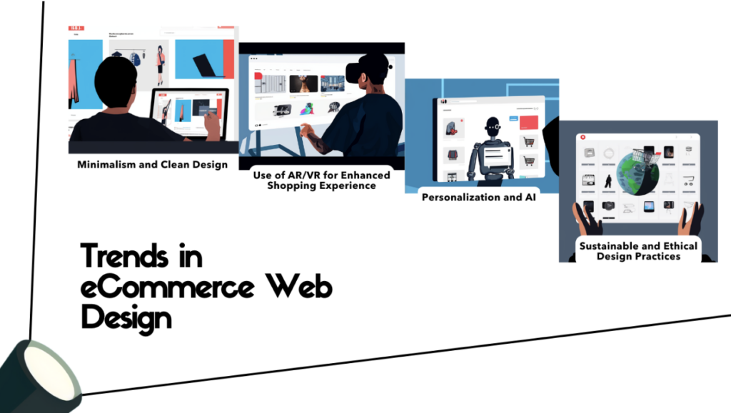
As the digital marketplace continually shifts, staying ahead of the curve with the latest trends in eCommerce web design is indispensable for commercial success. This year has ushered in a fresh wave of aesthetic and technological advancements, setting a new standard for the best web ecommerce design. Let’s explore the most groundbreaking trends that are reshaping the online shopping experience.
Minimalism and Clean Design
The mantra ‘less is more’ holds significant sway in today’s eCommerce environment. A minimalist approach prioritizes clean lines and uncluttered spaces, serving to enhance user focus on essential elements. This trend is not just about visual appeal; it enhances site navigability and optimizes loading times, anchoring itself within the realm of top ecommerce web design.
Use of AR/VR for Enhanced Shopping Experience
Augmented Reality (AR) and Virtual Reality (VR) are revolutionizing the online shopping experience by bridging the gap between digital and physical realms. Innovative retailers are employing these technologies to offer immersive product previews and personalizations, enabling consumers to visualize products in their own space before making a purchase decision.
Personalization and AI
Artificial Intelligence (AI) has empowered eCommerce sites to deliver personalization at scale. From personalized product recommendations to tailored content displays, AI is crafting unique shopping paths for each visitor. By harnessing consumer data, brands are creating personalized narratives that resonate with individual preferences and behaviors.
Sustainable and Ethical Design Practices
As society gravitates towards sustainability and ethical consumerism, eCommerce brands are responding through their web design. Responsible use of resources and transparent communication about eco-friendly practices have become compelling aspects of brand storytelling, reflecting a commitment to social responsibility in the digital sphere.
Common Mistakes in eCommerce Web Design
When aiming for top ecommerce web design, attention to detail is paramount. Yet, certain pitfalls frequently trip up even the most seasoned designers. These common mistakes can quietly undermine a website’s effectiveness, repelling potential customers and sabotaging sales. To craft a truly compelling and successful eCommerce site, it’s crucial to sidestep these oversights.
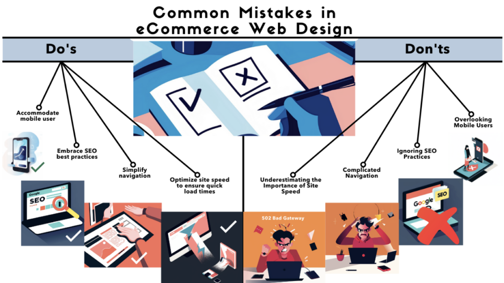
Overlooking Mobile Users
Despite the surge in mobile commerce, some online retailers still fail to prioritize mobile users in their design strategy. A non-responsive site that’s difficult to navigate on smartphones and tablets is a major deterrent in today’s market. This oversight can cost businesses dearly, as a growing portion of consumers favor mobile shopping.
Ignoring SEO Practices
Incorporating ecommerce web design tips that bolster SEO is crucial for online visibility, yet often neglected. Forgoing meta tags, keyword optimization, and other SEO fundamentals in design can hinder a site’s ability to rank in search engines, making it invisible to potential customers who rely on organic search for shopping.
Complicated Navigation
Complex navigation structures can confuse and frustrate users, compelling them to abandon their shopping carts. Streamlined navigation that facilitates an effortless journey from landing page to checkout is a hallmark of the best web ecommerce design. Websites must cater to the user’s need for clarity and ease.
Underestimating the Importance of Site Speed
Site speed is a crucial factor in user retention, yet its significance is sometimes undervalued in eCommerce web design. Delays in page loading can lead to increased bounce rates and abandoned carts, as modern consumers expect instant gratification. Prioritizing speed is non-negotiable for keeping visitors engaged and converting them into customers.
Implement the latest eCommerce trends
Our team stays on top of the latest trends and can integrate them seamlessly into your site.
eCommerce Web Design Tips for Increased Conversion Rates
To achieve the ultimate goal of any eCommerce site — heightened conversion rates — it’s essential to focus on certain design elements that can drive sales. Utilizing the best ecommerce web design tips, online stores can create an inviting digital environment that entices shoppers and guides them smoothly through the shopping journey. In this section, we’ll explore core strategies that can significantly impact your site’s conversion rates.
Clear Call-to-Action Buttons
One of the most crucial aspects of any website is the clarity and visibility of call-to-action (CTA) buttons. These buttons act as signposts for the customer, guiding them on what to do next — be it ‘Add to Cart’, ‘Learn More’, or ‘Complete Purchase’. Sharp, contrastive buttons with compelling copy can make the next steps irresistible. CTA design makes a substantial difference, as evidenced by the incremental increases in click-through rates that come from A/B testing variations in color, size, and placement.
Customer Reviews and Testimonials
Another vital aspect of establishing credibility and trust on a site is showcasing customer reviews and testimonials. Credible testimonials from genuine customers enhance the authenticity of your offerings and play a key role in a customer’s decision-making process. Implementing a section for user reviews can put potential buyers at ease, knowing that others have had a positive experience with your brand and products.
Upselling and Cross-Selling Techniques
When done subtly and smartly, upselling and cross-selling techniques can persuade customers to purchase additional items or upgrade their initial choice, effectively increasing the average order value (AOV). Designing product pages and checkout processes to include relevant suggestions can gently nudge consumers towards more valuable purchases, thus increasing the overall conversion rate and profit margin.
Incorporating Social Proof
Social proof is a psychological phenomenon where people follow the actions of others. By incorporating elements of social proof such as best-seller badges, real-time purchase notifications, or user count statistics, eCommerce sites can reinforce the impression that their products are tried, tested, and trusted. Displaying such proofs can significantly diminish purchasing hesitations and foster a sense of community and reliability around the brand.
Analyzing and Improving Your eCommerce Website Design
The online marketplace is perpetually shifting, leaving eCommerce platforms with an unyielding need to adapt and refine. The ever-evolving landscape of online shopping behaviors underscores the importance of an ongoing review and enhancement of eCommerce website design. Integrating best practices and top techniques can significantly revamp the way potential customers interact with your site, often resulting in improved user experience and increased sales.
A/B Testing for Design Elements
A/B testing stands as a cornerstone of data-driven design decision-making. By comparing two versions of a web page — each variant featuring a different design element — you gain reliable insights into what design choices lead to better performance. This method is quintessential for refining attributes like button color, product layout, and call-to-action placement to align with the best practices e-commerce web design.
Heatmaps and User Behavior Analytics
Understanding how users interact with your website is crucial to making informed design improvements. Heatmaps offer a visual representation of the most engaging sections of your site, while analytics delve deeper into user behavior patterns. Together, these tools can shed light on areas of the site where design enhancements are needed, helping you achieve a top e-commerce web design.
Gathering Customer Feedback
Critical to the growth of your eCommerce platform is the voice of the customer. Their feedback provides personal insights that no amount of analytical data can fully capture. Implementing mechanisms for customers to share their experiences and suggestions aids in crafting a user-centric design, epitomizing the best practices in the realm of e-commerce web design.
Continual Improvement and Iteration
An eCommerce site is never fully complete. As trends shift and technology advances, so must your website. The iterative process of design, test, feedback, and refine is fundamental to staying relevant and competitive. This commitment to improvement resonates strongly with visitors and is a hallmark of leading e-commerce web design strategies.
Analyzing user data and feedback is only the beginning. Transforming these insights into actionable design updates requires commitment and agility. Retailers who embrace this culture of continual refinement find themselves well-positioned to meet consumer demands effectively, contributing to better engagement, conversion rates, and overall success of their eCommerce venture.
Tools and Resources for eCommerce Web Design
To craft a successful eCommerce website, designers and developers utilize a spectrum of tools and resources that enhance the overall design and functionality of the site. Selecting the most suitable platforms and themes, coupled with ongoing performance evaluation through analytics tools, is pivotal for creating an engaging, responsive, and effective online store. Discover some of the most integral resources that can help apply e-commerce web design tips to your digital storefront.
Design and Prototyping Tools
Developing a user-friendly and visually appealing eCommerce website begins with the right design and prototyping tools. These resources enable designers to create interactive mockups and streamline workflows, ensuring that every aspect of the user interface aligns with the latest e-commerce web design tips. From Adobe XD for wireframing to Sketch and Figma for high-fidelity designs, these tools are crucial for bringing an eCommerce vision to life.
eCommerce Platforms and Themes
Selecting the correct eCommerce platform and theme is essential for the functionality and scalability of an online store. Platforms like Shopify, Magento, and WooCommerce offer diverse themes that are optimized for various business needs, incorporating best practices e-commerce web design. Whether it’s a focus on mobile optimization or user experience enhancements, these platforms provide the flexibility and tools needed to build a robust eCommerce website.
Performance and Analytics Tools
Monitoring your eCommerce site’s performance and user engagement is critical in understanding its health and areas needing improvement. Tools such as Google Analytics deliver insights into user behavior, while speed optimization tools like GTmetrix provide actionable recommendations to improve load times. Implementing these resources is central to maintaining a website that meets the e-commerce web design tips while ensuring a seamless shopping experience for users.
Case Studies: Successful eCommerce Web Designs
Exploring the eCommerce universe, certain websites stand apart as pillars of design excellence, their layouts and features serving as beacons for others in the industry. These platforms have achieved substantial commercial success, often becoming case studies for businesses looking to enhance their digital presence. By analyzing these exemplars of best web e-commerce design, key insights emerge, offering guidance to others striving to replicate their success in the realm of top e-commerce web design.
Study of a Leading eCommerce Website
One such laudable example is the global giant, Amazon. The company’s relentless focus on user-centric design principles has carved a niche for itself as an unparalleled player in the eCommerce sector. Amazon’s interface is famously streamlined, enabling users to navigate the sprawling catalog with ease — an embodiment of a user-first approach that defines the best web e-commerce design.
Design Elements That Led to Success
Amazon’s design incorporates a clear, intuitive layout that leverages familiarity and consistency. A persistent navigation bar and strategically placed search functionality reduce user effort significantly, making product discovery a breeze. Amazon also excels in the use of whitespace, guiding visitors’ focus to product listings and calls to action, a testament to its status as a leader in top e-commerce web design.
Lessons Learned and Takeaways
From Amazon’s success, several lessons can be distilled. Firstly, simplicity and ease of use should never be underestimated; they form the core of the best web e-commerce design. Secondly, personalization can make or break the user experience. By tailoring the shopping journey to individual preferences, Amazon keeps users engaged and coming back. Lastly, flexibility in scaling and adapting to user feedback has kept Amazon at the forefront of e-commerce innovation, encapsulating what it means to offer a top e-commerce web design. These insights pave the way for ongoing refinement and dedication to the user experience, aspiring to Amazon’s high standards in eCommerce platforms.
Avoid common eCommerce mistakes
Let our experts review your site and ensure you avoid these pitfalls.
Conclusion: Integrating Best Practices into Your Web Design
As we journey through the intricacies of effective eCommerce web design, it is evident that the fabric of online success is woven with strategic, user-centered approaches. Integrating the pillars of best practices in e-commerce web design paves the way for creating dynamic, responsive, and engaging online experiences that resonate powerfully with consumers. Navigating the fast-paced nature of digital trends demands a blend of aesthetic finesse and a deep understanding of consumer behavior, sealing the promise of growth and innovation in the eCommerce landscape.
Recap of eCommerce Design Principles
Revisiting the core fundamentals, we recognize that mobile responsiveness, high-quality imagery, clear navigation, and an intuitive checkout process are but a few hallmarks of outstanding eCommerce sites. Yet, beyond functionality and appearance, the true essence of e-commerce web design tips lies in creating delightful and frictionless user experiences. These experiences not only foster immediate conversions but also nurture long-term customer relationships — a testament to impeccable service and trust.
Actionable Steps for Implementing Best Practices
To manifest these design principles into tangible results, action is essential. Begin by evaluating the mobile-friendliness of your site, optimizing load times for swifter access, and curating product visuals and descriptions that invite interaction. Enhance the user journey with straightforward calls-to-action and an easy checkout process, backed by security features that reassure each customer. Moreover, embed SEO considerations into your design process, amplifying your brand’s visibility and reach in the ever-competitive online marketplace.
The Future of eCommerce Web Design
Peering into the vast horizon of eCommerce’s future, it is clear that the evolution of web design will continue at an exciting pace. Advancements in AI, AR, VR, and personalization technologies will further customize shopping experiences, while sustainability and ethical practices will rise in priority. Adapting to these shifts, informed by e-commerce web design tips and best practices e-commerce web design, will ensure that businesses don’t just keep up but lead the charge in the digital economy. The journey forward is one of continuous learning, improvement, and innovation — a journey that starts with every element of a well-designed eCommerce website.
Bring your eCommerce vision to life
Our team can build you a high-converting eCommerce site optimized for sales.