Healthcare data visualization turns clinical, operational, financial, and patient-generated data into views that help people act faster. The hard work is choosing the right decision, metric, source system, refresh cadence, access rule, and workflow response before building charts. Without that work, dashboards become another reporting burden.
What Healthcare Data Visualization Should Help People Decide
Healthcare data visualization should start with the decision a user needs to make, then work backward to the metric, data source, refresh rate, and response. If a view does not change a clinical, operational, financial, or public health action, it is probably reporting noise.
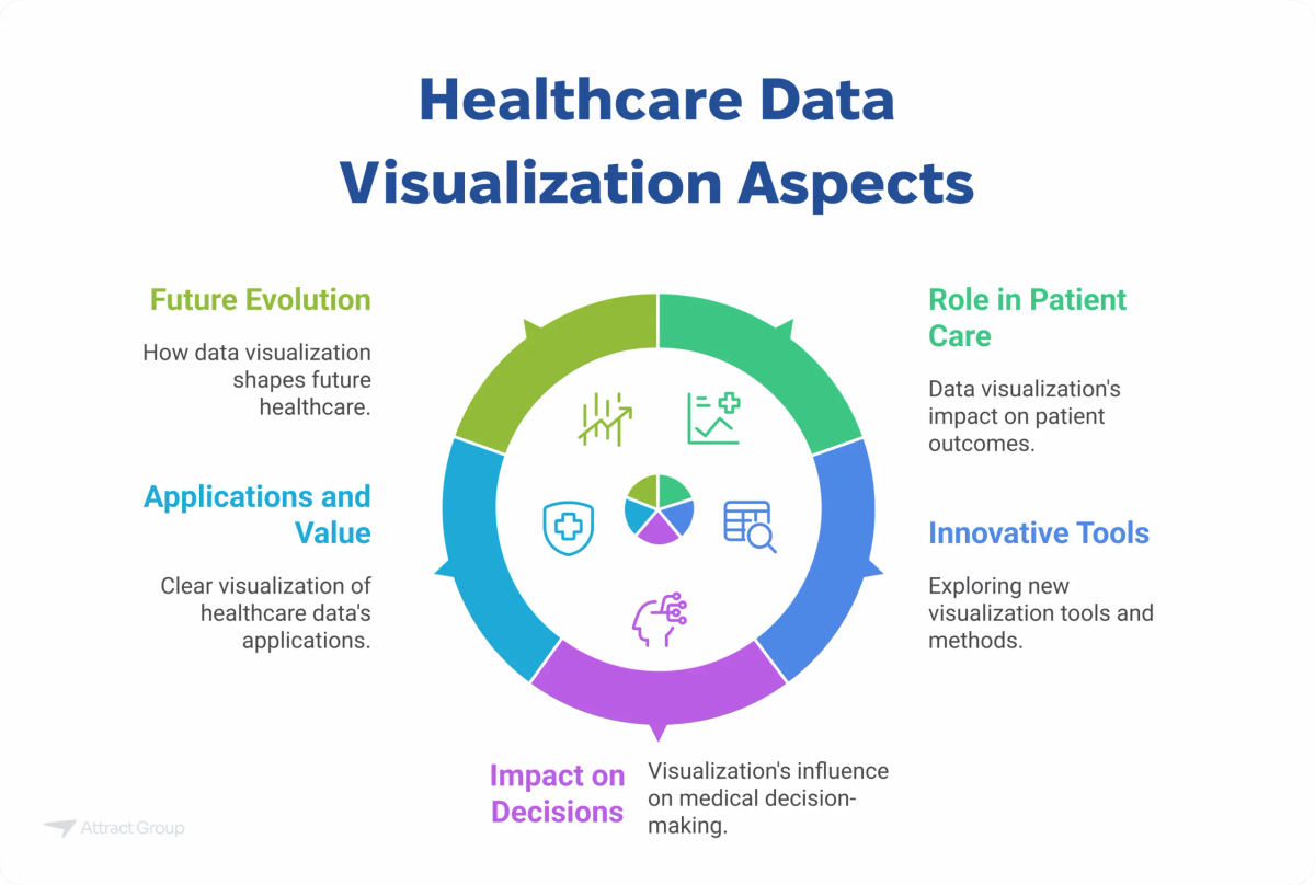
Healthcare teams usually need visualization across five decision classes:
- Clinical monitoring: Which patient needs review now? Examples include abnormal lab trends, remote monitoring signals, medication adherence gaps, or risk flags in a clinical portal.
- Operational throughput: Where is capacity constrained? Common views track patient flow, bed status, appointment utilization, queue length, turnaround time, and staffing coverage.
- Quality and safety: Which process is drifting from the expected range? Dashboards can track readmissions, infection surveillance measures, incident categories, missed follow-ups, or care-gap closure.
- Revenue cycle and finance: Where is money delayed, denied, or leaking? Useful views show claim denials, aging AR, payer mix, coding queues, underpayments, and payment collection.
- Population health and public health: Which cohort, region, or risk group needs action? Examples include chronic disease registries, vaccination coverage, outreach lists, and geographic demand patterns.
For population health and public health programs, the CDC Data Modernization overview is a useful reference point for connected, faster data exchange. At the local product level, the same idea still depends on clean definitions, governed sources, and clear ownership.
Common Visualization Types and When to Use Them
The best visualization type depends on the decision pattern: current status, movement over time, unusual variation, location, patient progression, or work queue. A clean chart can still mislead if the measure is unstable, the denominator is wrong, or users need an action list instead of a picture.
Healthcare Visualization Types by Decision
| Visualization type | Best for | Healthcare example | Watch-out |
|---|---|---|---|
| Dashboard/cards | Fast status checks and executive summaries | Bed occupancy, appointment fill rate, denied claims, open referrals | Can hide trend, denominator, or variation behind one number |
| Trend line | Movement over time | Lab value history, patient volume, monthly denial rate, device signal trends | Can imply a pattern where seasonality, missing data, or workflow changes explain the movement |
| Control chart | Process stability and variation | Lab turnaround time, infection surveillance measure, call center response time | Needs enough data and a stable definition; false signals appear if process changes are not noted |
| Heat map | Concentrations by time, unit, category, or severity | ED arrivals by hour, no-shows by clinic, staffing gaps by shift | Color scales can exaggerate small differences or hide low-volume uncertainty |
| Cohort/funnel | Step-by-step progression | Referral to appointment to visit completion, portal invitation to activation | Selection bias and missing steps can distort drop-off |
| Geospatial map | Regional demand, access, or public health patterns | Outreach by ZIP code, disease registry distribution, mobile clinic planning | Small-area maps can expose identity or imply cause without context |
| Exception queue | Work that needs action | High-risk RPM patients, unsigned notes, overdue labs, rejected claims | Turns into alert fatigue if thresholds and owners are weak |
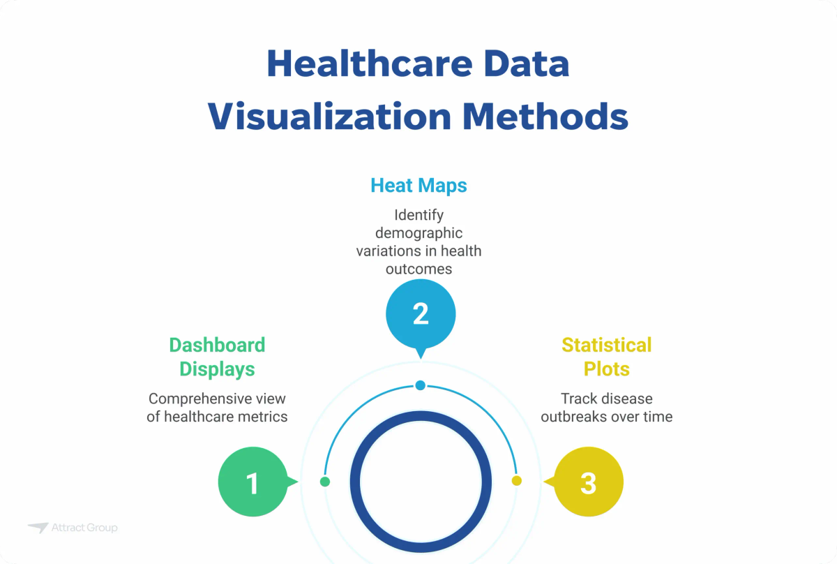
Use dashboards and card views when users need a rapid summary. Use trend lines and control charts when the question is whether a process is changing or unstable. Use heat maps and geospatial maps when location, timing, or category concentration matters. Use exception queues when the view must drive a task.
Data Sources and Architecture Behind the Dashboard
A healthcare dashboard is only as dependable as its sources, transport, metric logic, and access controls. Before choosing chart libraries or BI software, map where each data element starts, who owns it, how often it changes, how PHI is protected, and what system receives the user's response.
Common source systems include:
- EHR/EMR: encounters, diagnoses, procedures, medications, vitals, orders, notes, care plans
- Claims and billing: submitted claims, denials, remittances, payer rules, payment status
- Lab systems: test orders, results, reference ranges, turnaround time
- Imaging metadata: modality, order status, report status, scheduling, turnaround time
- Scheduling systems: appointments, cancellations, no-shows, provider availability
- Patient portals: messages, forms, registration, consent, engagement events
- Devices and wearables: remote monitoring signals, adherence data, patient-generated events
- CRM and outreach tools: campaigns, call outcomes, referrals, lead sources
- Inventory systems: supplies, medication stock, equipment availability
- Staffing and HR systems: shifts, roles, coverage, time tracking
- Finance systems: invoices, payments, collections, budgets, cost centers
A solid architecture usually defines:
- Source-of-truth rules: Decide which system wins when data conflicts. For example, the EHR may own clinical facts, while the billing platform owns claim status.
- FHIR/API feeds: Use APIs where near-current data and interoperability matter. For health IT planning, the ONC HTI-1 final rule overview is relevant to API access, transparency, and certified health IT obligations.
- Batch vs streaming: Batch works for executive reporting, monthly quality review, and finance. Streaming or near-real-time feeds are better for remote monitoring, command centers, and exception queues.
- Warehouse or lakehouse: Centralize structured and semi-structured data for analytics, history, and cross-system reporting.
- Metrics layer: Put definitions in one place so "no-show rate," "average wait time," or "active patient" does not change by department.
- Role-based access: Limit views by role, facility, care team, patient relationship, or business function.
- Audit logs: Record access, edits, exports, threshold changes, and administrative actions.
Attract Group's RAE Health work is a useful pattern for remote monitoring and clinical portal reporting. The product combines wearable signals and manually logged stress or craving events, a mobile app, RAE Connect for caregiver/provider visibility, and a web clinical portal with statistics and charts. The AWS-heavy backend and 24+ month, $200,000+ engagement show the architecture question: which signals need near-real-time visibility, which events can be batched, and which views are meant for patient self-management versus provider review.
For a broader view of analytics programs beyond visualization, see our guide to data analytics in healthcare.
Building Dashboards That Clinicians and Operators Trust
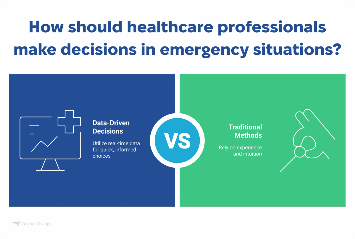
Trust comes from definitions, lineage, timing, and ownership more than from visual polish. Clinicians and operators need to know what a metric means, why a patient or task appears, when the data was last refreshed, and who is expected to act when a threshold is crossed.
Build trust into the dashboard before rollout:
- Metric definitions: Document numerator, denominator, exclusions, time window, and source system. Put definitions close to the chart, not in a separate file nobody opens.
- Data lineage: Let administrators trace a metric back to source tables, APIs, files, or business rules.
- Timeliness: Show last refresh time. Do not present yesterday's data as a current operational view.
- Thresholds: Define normal, warning, and critical ranges with the people who own the workflow.
- Exception handling: Show why an item is in the queue and what action is expected.
- Workflow ownership: Assign each alert, metric, or queue to a role, team, or department.
- Accessible design: Use readable labels, color-safe palettes, keyboard-friendly interfaces, and clear text alternatives where needed.
- Mobile and desktop context: A clinician checking a patient flag on mobile needs a different view than an operations leader reviewing weekly performance on desktop.
- No vanity charts: Remove charts that look impressive but do not change staffing, care coordination, outreach, billing, or quality review.
The same measure can serve different roles, but the view should change by job. A CFO may need denial trends by payer. A billing supervisor may need a denial work queue. A clinic manager may need daily appointment leakage by provider schedule. A care coordinator may need a list of patients who missed a follow-up.
Security, Privacy, and Compliance Risks
Healthcare visualization can expose PHI through filters, labels, exports, screenshots, access logs, and vendor support sessions. Treat every dashboard as part of the regulated product surface: define minimum necessary access, protect ePHI in transit and at rest, and record who viewed, changed, exported, or shared data.
Plan for these risks early:
- Minimum necessary access: Give users the least amount of identifiable information needed for their role.
- PHI/ePHI boundaries: Separate operational metadata from identifiable clinical data where possible.
- Row-level security: Restrict records by role, facility, care team, patient panel, payer, or contract.
- De-identification and aggregation: Use aggregated or de-identified views for executive, research, or public reporting when individual identity is not needed.
- Audit logs: Track viewing, filtering, exports, permission changes, and administrative actions.
- Consent where needed: Account for patient consent rules when sharing data with caregivers, partners, apps, or research workflows.
- Exports and screenshots: Limit CSV, PDF, print, and screenshot exposure where the risk is high. Watermarking and export logs can help.
- Vendor access: Define how support teams access production data, how sessions are approved, and how access is revoked.
If your dashboard uses cloud services, the HHS HIPAA cloud guidance is a relevant reference for business associate responsibilities and ePHI handling. Security planning should also consider the HHS Healthcare and Public Health Cybersecurity Performance Goals, especially for identity, access control, backup, incident response, and third-party risk.
Implementation Plan and Cost Ranges
Scope the first release around one workflow, a small set of measures, and a defined user group. A dashboard that starts with three trusted sources and one response path usually beats a large reporting portal with weak definitions, slow refreshes, and no owner for exceptions.
A practical build plan:
- Choose one workflow and one decision. Example: reduce appointment leakage, prioritize remote monitoring review, manage claim denials, or monitor patient flow.
- Define users and actions. List who opens the view, how often, what they decide, and where the action happens.
- Map data sources. Identify source systems, owners, available APIs or exports, data quality issues, and historical data needs.
- Define metrics and thresholds. Document formulas, time windows, filters, and exception rules.
- Design low-fidelity screens. Validate layout, labels, drilldowns, filters, and work queues before development.
- Build data pipelines and access rules. Implement ingestion, transformation, storage, metrics logic, role-based access, and audit logging.
- Validate with users and sample cases. Test metric accuracy, refresh timing, edge cases, and workflow handoffs.
- Release in phases. Start with a pilot group, then expand sources, roles, alerts, and automation.
Planning ranges:
- Focused operational or executive dashboard: about $20k-$60k, 4-8 weeks
- Clinical, remote monitoring, or multi-source dashboard: about $60k-$180k, 2-5 months
- Enterprise analytics platform with governance and multiple integrations: $180k+ and 5-12+ months
Cost drivers include:
- Number and maturity of source systems
- API availability and interoperability constraints
- Data quality, duplication, and missing fields
- Refresh speed: batch, near-real-time, or streaming
- PHI controls, access rules, audit logs, and compliance review
- Workflow automation, notifications, and alerting
- Metric validation and clinical or operational review
- Number of user groups, facilities, and permission models
- Support model, monitoring, documentation, and training
Attract Group's Clinicsoft case shows how operational views can grow from fragmented clinic workflows. The project budget was $20k-$50k with a 4 month development time, covering CRM, ERP, and HRM modules for appointments, queue and consultation flow, inventory, HR, reports, payments, invoices, campaigns, and notifications. The lesson for dashboard planning is straightforward: role-specific reporting is easier to build when appointments, consultations, inventory, billing, and communications are modeled as connected workflows.
Vendor Questions Before You Build
Use vendor questions to test whether the team can handle healthcare data, not only dashboards. The right discussion should cover ownership, interoperability, privacy, validation, usability, support, and the operational response after an alert or exception appears on screen. Ask for tradeoffs, not promises.
Ask these questions before signing a dashboard or analytics scope:
- Which decision and workflow will the first release improve?
- Who owns each metric definition, threshold, and exception rule?
- Which source system is authoritative for each data element?
- How will the product use FHIR, APIs, files, or manual imports?
- What happens when source systems disagree?
- How will role-based and row-level access be enforced?
- How will PHI appear in filters, exports, logs, screenshots, and support sessions?
- What test data will be used before production data is available?
- How will metric accuracy be validated with clinicians, operators, finance, or quality teams?
- How will the design be tested with desktop, tablet, and mobile users?
- What prevents alert fatigue?
- Where does each alert or exception go after it appears?
- Who maintains data pipelines, metric logic, permissions, and dashboards after launch?
- What monitoring exists for failed feeds, stale data, and permission errors?
- How are future measures, integrations, and AI features added without rebuilding the platform?
Start with one workflow and one decision to improve first. Define the users, metric, data source, refresh cadence, access rule, and response path before choosing charts. That approach keeps healthcare data visualization tied to care delivery, operations, finance, and quality work rather than static reporting.
Planning a healthcare dashboard or analytics product?
We can define the workflow, source systems, access rules, and build plan before the dashboard work starts.